by Bryan, Chloe, and Younho
Visual Language: Design Analysis
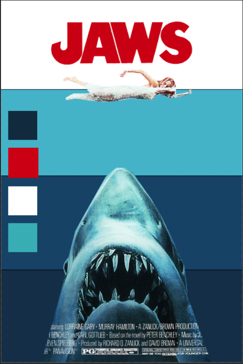
I chose the famous movie poster from the Steven Spielberg movie Jaws. I knew that I wanted to analyze a movie poster and Jaws was one that immediately sprung to my mind. Although it is visually simple, it is intensely memorable. I decided to figure out why this movie poster is such a staple in classic American film.

Hierarchy
There are three main elements in the poster: the title, the woman, and the shark. They are all approximately the same width and are all centered within the page. However, in terms of height, the shark takes almost 50% of the poster height, and all it's showing is its head. This loudly informs the audience that this shark is more monster than animal.

Here to the right, you can easily see how imposing the image of the shark is when compared to the title and the woman. Another thing to note is that the woman is caught in between these two other elements. She is visually caught between two sets of jaws. She has nowhere to go, and we feel the peril that she herself has yet to even acknowledge.

Color palette
There are three main colors in the poster: red, white, and blue. The film takes place during the 4th of July, so the color scheme works in regard to subverting the general fun and carefree that we usually associate to this holiday. The red JAWS title invokes a sense of danger and the color of blood in the water.

There are many shades of blue in this poster. It starts with a light shade of blue where the water meets the sky. It then gets darker and darker as the water gets deeper, representing the ominous and dangers that are waiting underneath the waters. As seen to the right, the white background only takes up about 25% of the poster. The rest of the poster is blue, which feeds into the unknown fears we have of the sea.
Typography/Negative space
The closest font that I could find for the title is Franklin Gothic Bold. There is a font out there named Amity Jack, but that font was created in 2009 so it was likely inspired by the movie. The A, W, and S follow the Franklin Gothic Bold typography closely, however the J seems to have been altered. The end is angled and cutoff, creating a fishhook like image. I also noticed that the sharp triangles in the A and W created by the negative space look a bit like teeth, which enhances my previous point on how the woman is about to be eaten by two sets of jaws.

The Jaws poster is one of the most memorable aspects of this great film. It's simplicity and color scheme invokes many feelings about the dangers of the unknown. I no longer watch movie trailers since they give away too much of the plot of a film, so I am paying much more attention to movie posters these days. Although most are generically bland and uninspired, when I do see an interesting poster, it will lure me to the theater like no other.

Intro to Comp Media: p5.js portrait
I worked as an Android Developer at my last job for two years. During that job, my favorite part of it was debugging and tracing through code that I did not personally write. It was voyeuristic and enlightening, reading someone's computational diary and learning about another person. However, you could not see that through the final product. That is what makes computation fascinating to me because there are so many different ways to tackle a specific problem. I am very interested in projects that can visualize or depict an individual's problem solving thought process through their interaction with an external device. Games come to mind. Boardgames or puzzle games that require the player to solve a specific problem really show a side of human creativity and behavior that I find fascinating.
With that being said, the hardest part of this assignment was not solving the problem, but figuring out what WAS the problem. I didn't really want to completely remake a known piece of art. Nor did I want to create something that looks dumb. So I did a bit of both.
I love watching movies and I love playing video games. Vertigo's movie poster is pretty famous for its design seeing as how I had a poster of it hanging in my room before I even watched the movie (it was ok). I decided I would try to recreate that poster, but with a twist by replacing the silhouettes of the man and woman with some Tetris pieces.
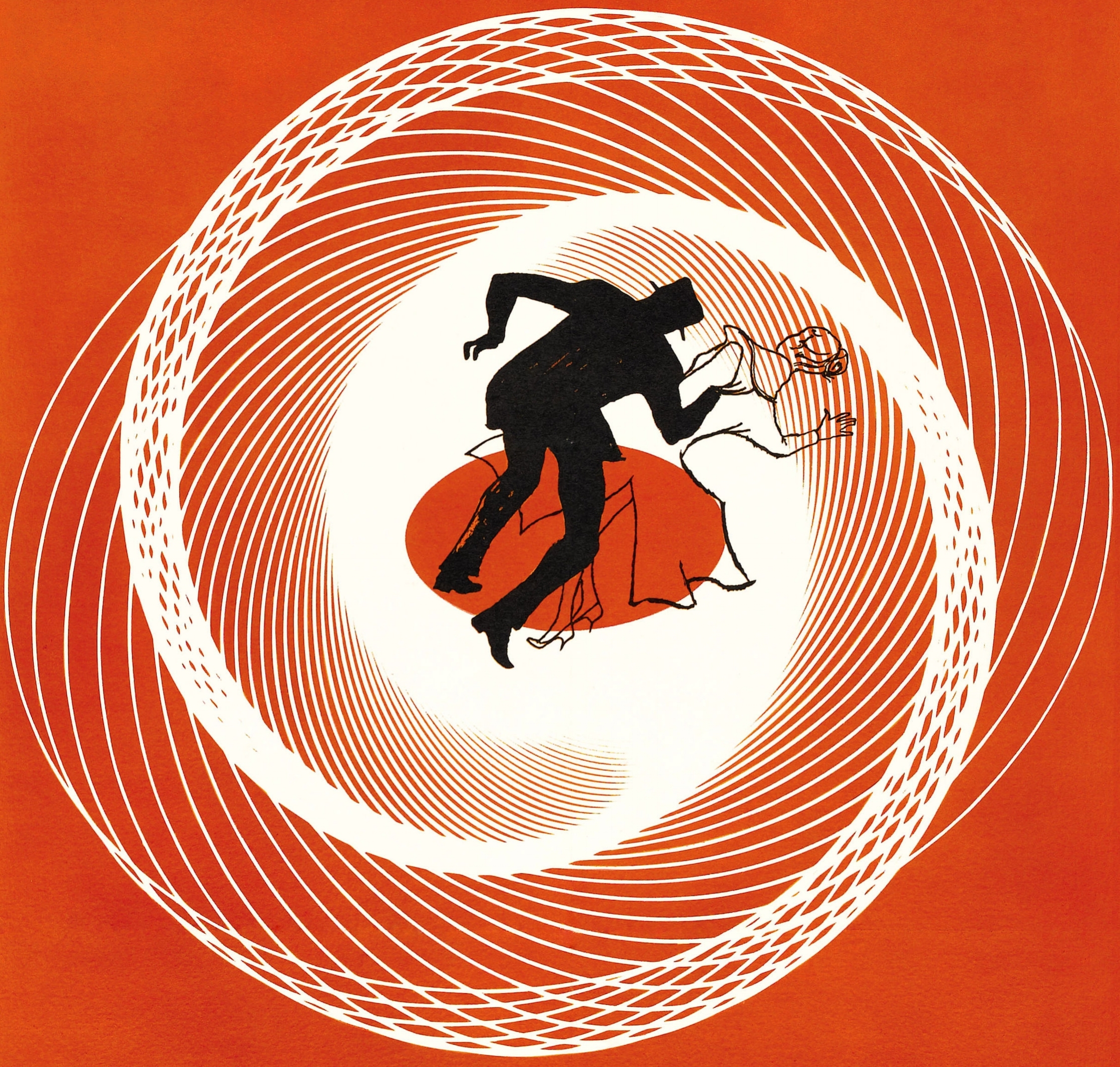
I attempted to recreate the spiral in the Vertigo poster and completely failed. There was no way I was going to spend my time recreating it manually since I knew it could be done with some kind of algorithm. But good luck staring and analyzing that spiral without getting any migraines. I decided to go for something much simpler. I ended up with this:
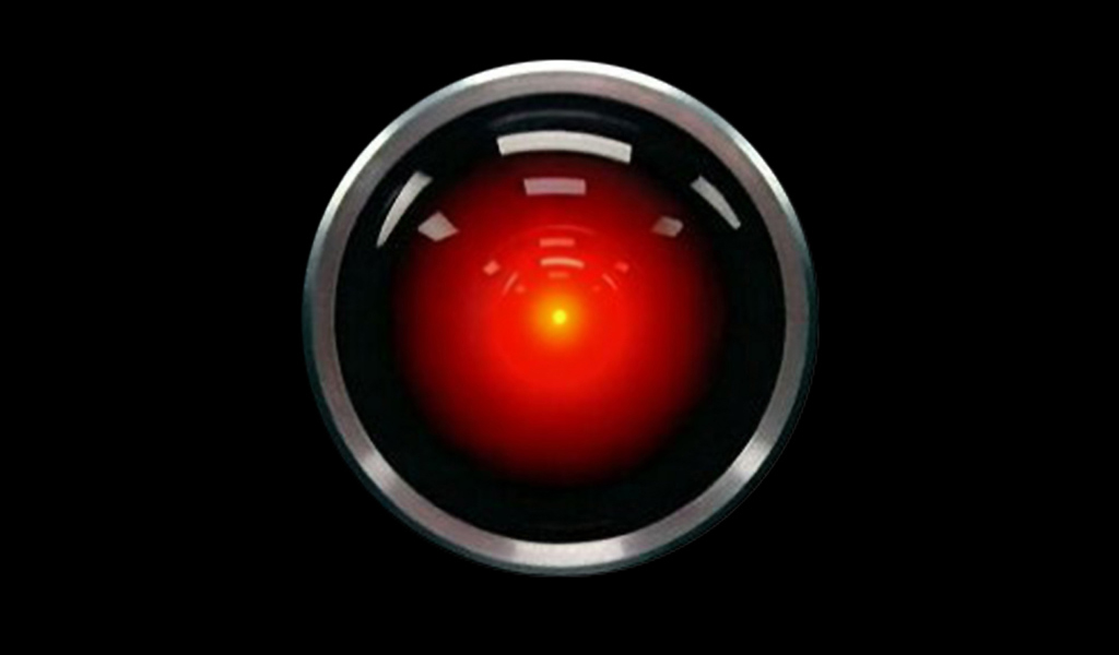
To be honest, I thought this looked really stupid. The repeated circles did not give me the headaches I wanted, and the Tetris block looked completely out of place. The upside was that the circles and the iris ended up looking a bit like H.A.L.
In order to add to the disorientating nature that the original Vertigo poster had, I played around with how I was creating the circles in my loop. I was surprised to see that such minor changes, like incrementing the position of a coordinate, could cause such a cool looking effect. I also lowered the opacity for most of my fills, which made the portrait a bit more glowy. This is the end product:
The web editor is pretty easy to use. I kind of wish it had some sort of capability to automatically autocomplete method names like in an IDE, but having the reference page on another browser tab was good enough. It did crash on me a couple times, and I lost a bit of progress because I didn't save. There should definitely be some sort of auto-save. Overall, it was a fun and fresh experience, and I can't wait to get even deeper into p5.js.
Intro to Phys Comp: Physical Interaction
I agree with Chris Crawford when he said that interactions should be a measurable attribute, rather than a binary yes or no. Like a conversation, the amount of physical interaction also depends on the amount of effort put into listening, thinking, and speaking by both "actors." This effort goes along Bret Victor's proposal on how the human body contains an infinite-like amount of interaction output methods and we should not limit these interactions to only our fingers. I define physical interaction as a sliding scale that measures the combined effort that actors communicate among each other. You can think of it as how "in love" these actors are with each other. When the communication is forced and awkward, there is no second date. But when that spark appears, and conversation is seamless and enjoyable, that is when physical interaction would be at its best.
Now that I think about it, there isn't very much digital technology that would be considered something with high physical interaction. Like Victor said, we rely so heavily on our hands that we often forget the rest of our body. I think that smartphones are surprisingly not as physically interactive as they should be. The only recent feature I could think of that gives feedback to the user would be Apple's 3D touch, and even that feature is kind of wasted since it is typically used to the exact same extent as a long hold press. Although having more haptic feedback is a step in the right direction, the step is far too small for my liking.
Nitish, Ari, and I worked on creating a self sustaining shoe for our fantasy device. Although our first major concern seemed to be how a shoe could self sustain itself, we also started to think of ways the shoe could act as a sort of "smart" shoe.
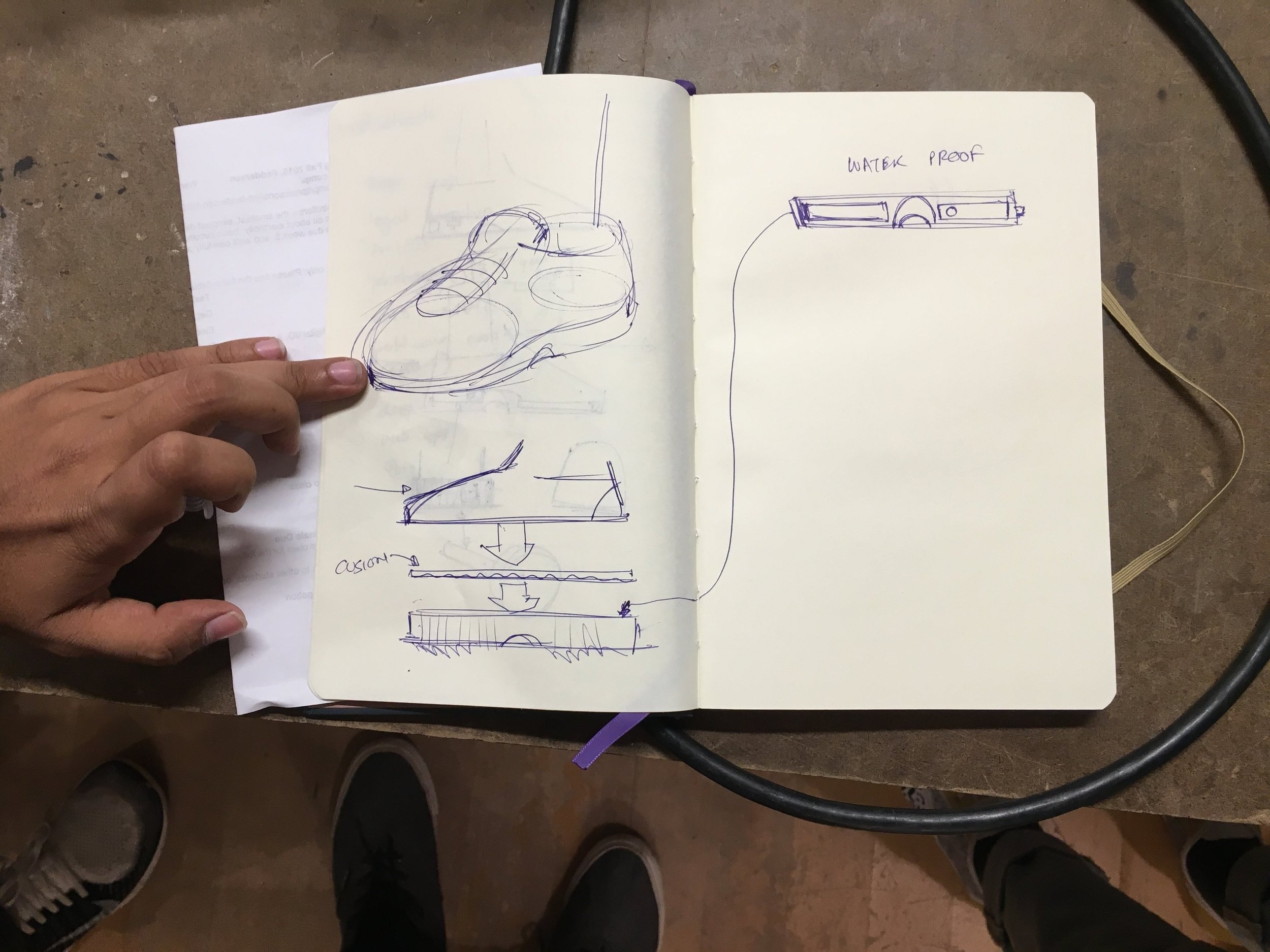
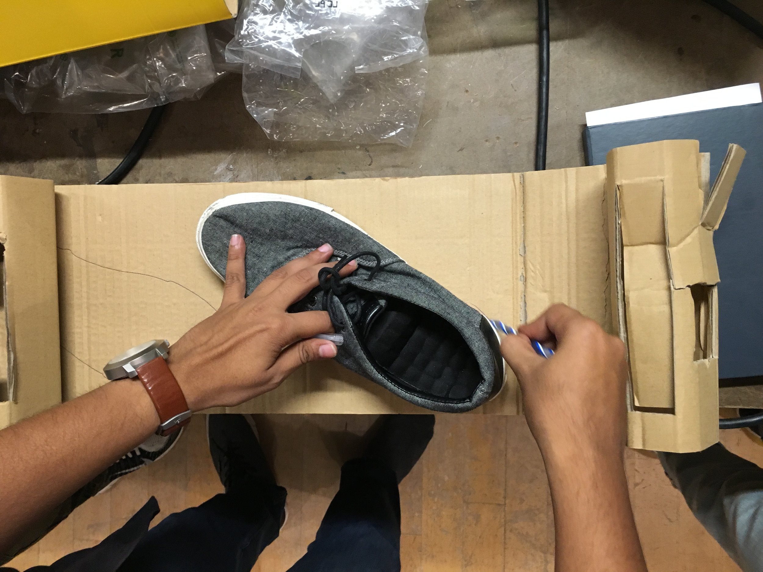
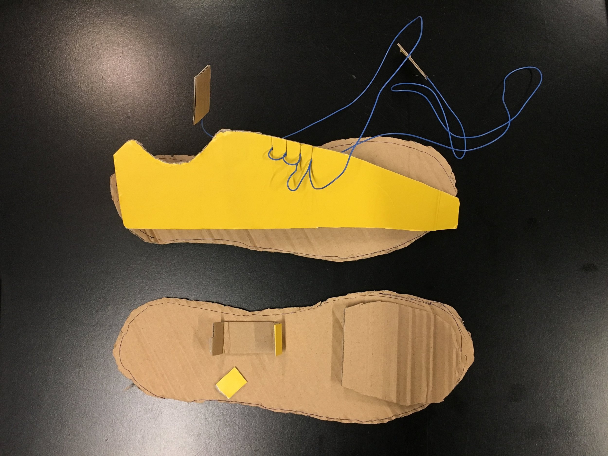
After the readings, I started to think of what physical interactions we could implement to such a shoe. I immediately thought of using toes as a method of input. People who have lost their arms have learned to adapt and utilize their feet and toes to do tasks that many would find difficult without hands. I think that studying the behavior of those who are forced to change the way they interact with the physical world could reveal interesting possibilities for future technologies.
Video and Sound: Soundwalk

I started the audio walk around 11:45am.
The sounds from the real world blended with the audio from my headphones, creating a surreal state of both past and present. I wandered through Central Park in another realm. It was isolating.
And it was spooky as hell. I wouldn’t know whether the sounds came from my phone or the world. I would hear kids running and playing, look around, and see no kids. Ghost kids?...
And then there’d be moments when Cardiff would narrate EXACTLY what was going around. She literally narrated “a woman is taking a photograph,” and ten feet to my left I’d see a woman taking a goddamn photograph! I looked around and imagined Cardiff surveilling me from afar.
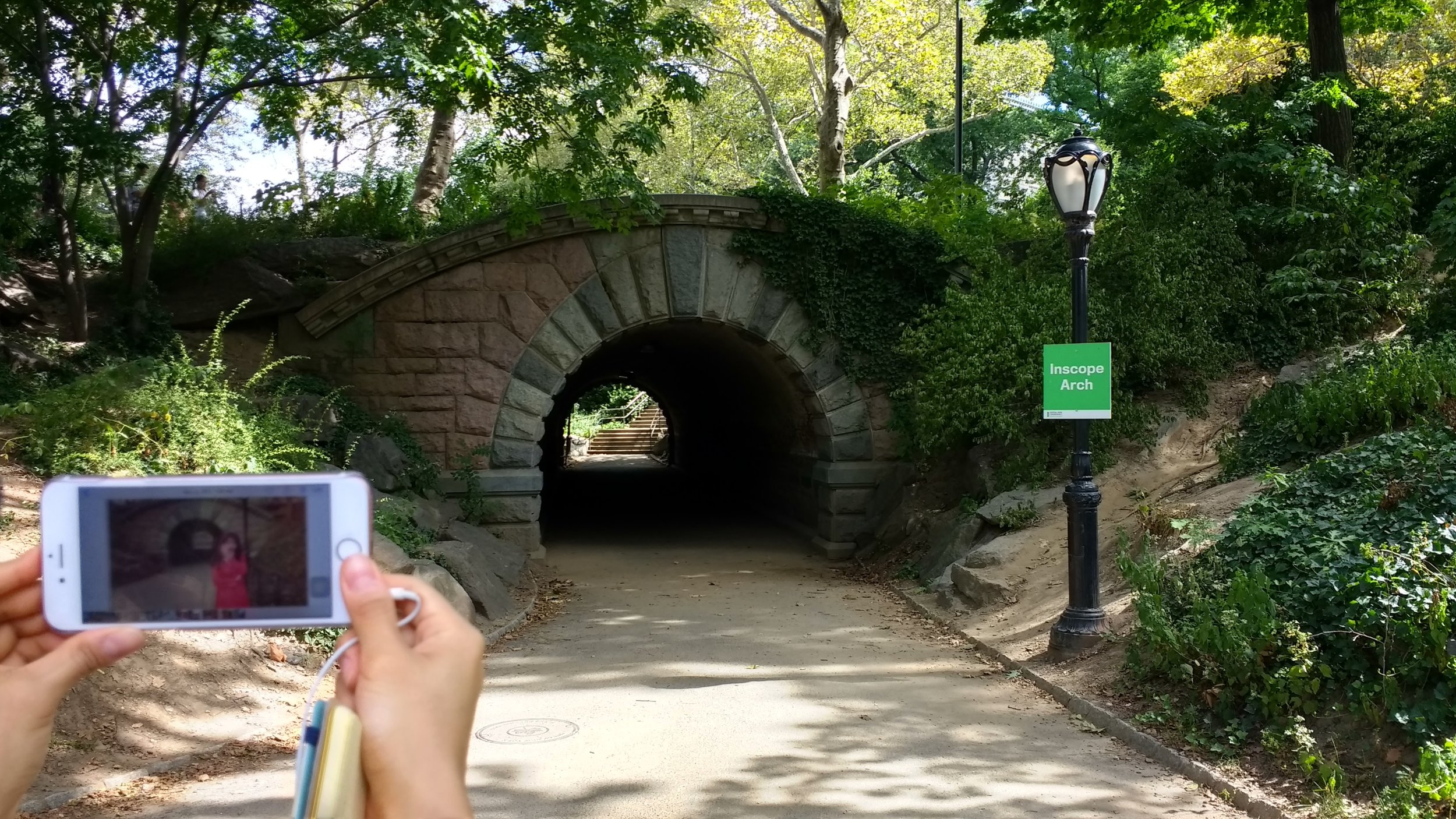
Events like these happened throughout the walk. I was there, and then I wasn’t.
When I reached the clock tower in the zoo, I heard a bell. I assumed it was from the audio, until I realized that it wasn’t. It just so happened to be noon time and the clock bell rang and rang. To make sure, I cheated and removed my headphones, leaving Cardiff’s past. The noise of the present was quieter, with only the bell ringing in the background.
I put my headphones back on, hearing again those ghostly children laughing along with that clock tower bell. The music of the past is discordant with that of the present, yet we can’t help but to look backwards and find those brief moments of harmony.

Thanks to Danni H. for accompanying me and helping me with these pictures!